Have you ever wondered if your online portfolio is meeting the expectations of creative directors, prospective clients, art buyers or potential employers? For nearly 10 years I have had the privilege of serving the creative community by helping visual artists create an online portfolio. In my experience, there isn’t a more effective way to display creative work online than within the confines of the well-known Minimalist design precept “less is more” where the goal is to reduce a subject to its necessary parts. When applied to an online portfolio the presented work becomes the focal point of every page — just as it should be.
I’ve come up with a list of 5 tips or benchmarks that every visual artist should follow when creating an online portfolio.
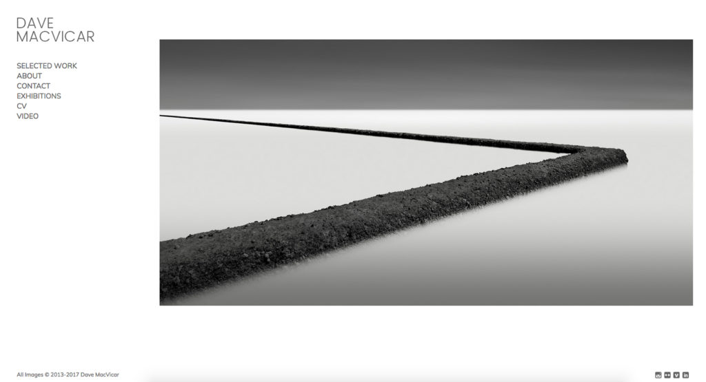
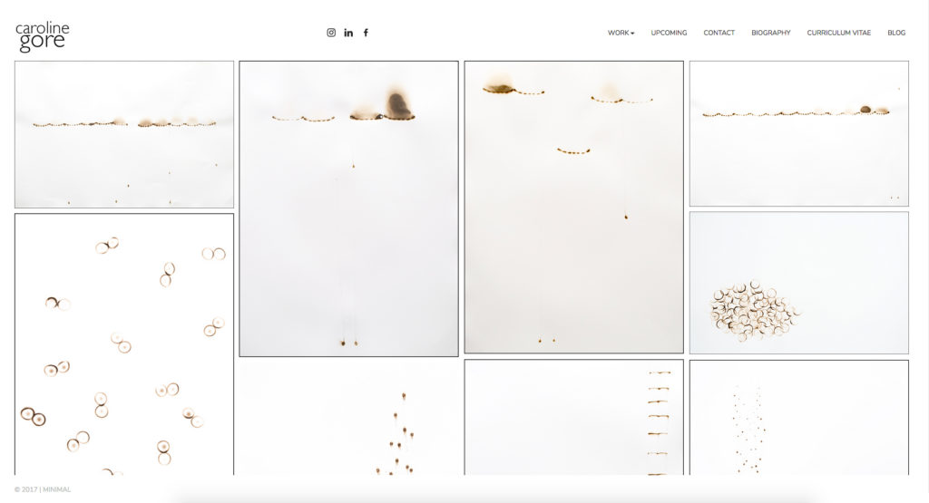
5. Maximize negative space
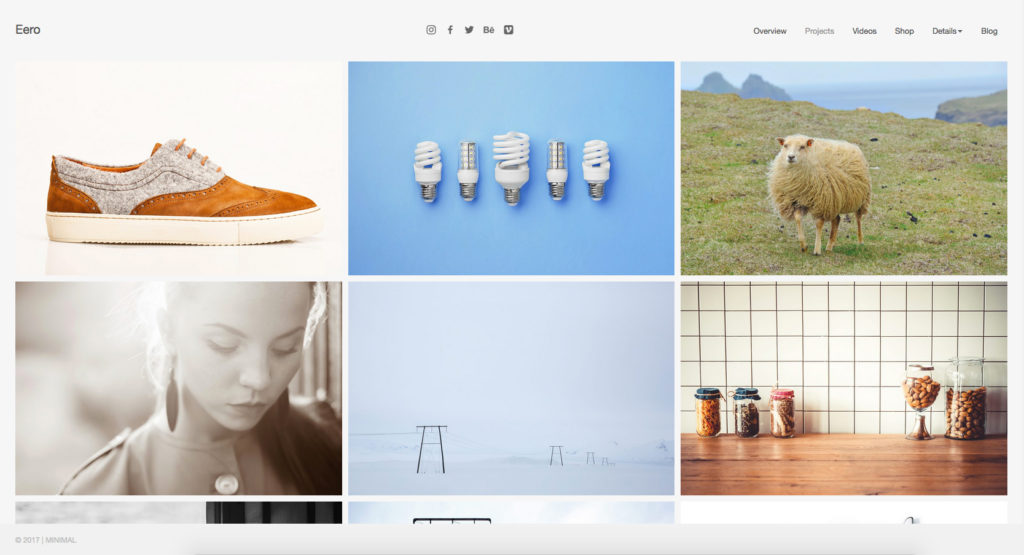
Negative space is the area surrounding the main subject. Creative professionals are often intuitively aware of the value of negative space within their work but it’s also important to expand your perspective to include negative space as it relates to the portfolio presenting your work. Note the following two examples which effectively allow the creative work being displayed to become the focal point of the web page without compromising the user experience in terms of communicating information about the work itself, or how to navigate the site.
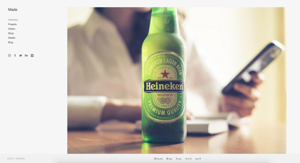
Left: Made theme | Live demo
Right: Eero theme | Live demo
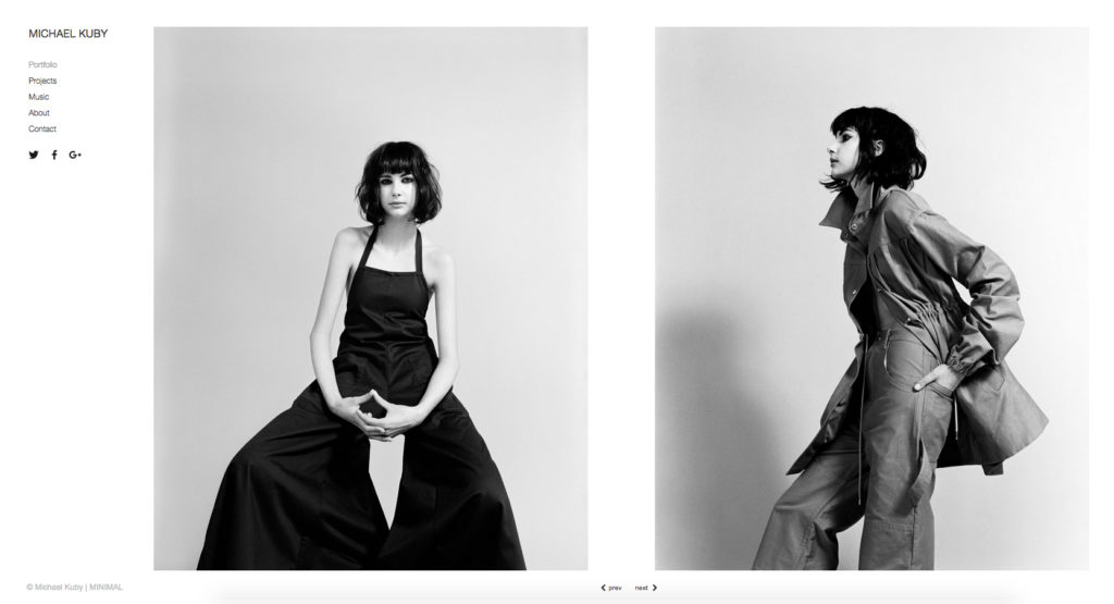
4. Use a simple site navigation
KIS (i.e. Keep It Simple) is an acronym for a design principle noted by the U.S. Navy in 1960. The KIS principle states that most systems work best if they are kept simple rather than made complicated; therefore simplicity should be a key goal in design and unnecessary complexity should be avoided. (Wikipedia)
A practical online portfolio must be easy for a user to navigate. The two primary areas of navigation include the site menu (i.e., how a user navigates from one page to another) and the site gallery(s) (i.e., how a user navigates from one image to another).
Again, note the examples to the linked live demo sites above. The menu location of each site is clearly understood and is visually supported by a smart combination of color scheme and typography; elements that promote a positive user experience which is, of course, the overarching goal of an online portfolio.
3. Present images that scale
Images in your online portfolio should dynamically scale down to fit within the view space on desktop screens as this is the expectation of viewers on these devices (mobile design may optionally streamline images into a single column or offer a 1-finger swipe). This means that the best user experience on desktop screens happens when a viewer is not required to scroll down to complete viewing a single image. Likewise, images should be allowed to dynamically scale up to fill larger screens, a feature that creative directors enjoy.
It’s worth noting that image scaling is considered a best practice and like all things creative, it’s alright to break the rules. The important thing is that you first understand what is considered a conventional rule so you can exercise your creative liberty in breaking it.
The following examples demonstrate dynamic image scaling. Note how gallery images automatically resize to fit within the view space on desktop screens and how they align into a single column on mobile devices offering a quality cross-device user experience. Acceptable mobile gallery layouts generally include a single scrollable column or 1-finger swipe experience.
2. Pay attention to page speed
Perhaps the most unrecognized aspect of a compelling online portfolio is page speed. Normally, when page speed is recognized by the viewer it is because a page is loading too slowly. When this happens visitors are likely to leave your site sooner than they would have otherwise.
A well-crafted code base is the foundation of a fast loading site followed by images that have been optimized for use on the web (i.e., 72dpi – JPEG format – Save for Web in Adobe Photoshop at High or Very High compression quality) and supported by quality web hosting. For WordPress sites, quality shared hosts include Bluehost, DreamHost and SiteGround. For premium WordPress hosting (i.e., optimized and managed) at a relatively affordable price WP Engine provides the best value in terms of technology, speed, security and support.
1. Embrace responsive web design
Are your site visitors Mac or PC? Are they viewing on 13-inch, 15-inch, 21-inch or 27-inch screens? Do they view from desktop, tablet or mobile devices? Which browsers do they prefer (e.g., Chrome, Safari, Firefox, Internet Explorer)? The list goes on. Only a few years ago each of these questions had to be carefully considered with a web developer prior to commencing an expensive custom project ranging from $5,000 – $15,000. Today, a well-crafted WordPress portfolio theme will have already addressed these important considerations through responsive web design, an approach to web design which makes pages render well on a variety of devices and/or screen sizes.
If your online portfolio isn’t meeting these 5 benchmarks it’s probably not meeting the expectations of your intended audience or performing as well as it could be.
Join the conversation by sharing your own thoughts and feedback in the comments.